CardSpace: how images are mapped on cards
Architects and developers often overlook it, but the details of how things are rendered is of great importance for designers. This post explains how the CardSpace UI deals with the artwork assigned to cards, so that you can plan for predictable results. Special thanks to Mark Oluper for his brillian explanation!
When you create a self issued card, you can assign to it an image that will help you understand at a glance what the card is all about. Similarly, when an Identity Provider creates a managed card it can embed in it the graphic that will be used as the background for the card in the Identity Selector (wanna play with it? check out this toy).
In this version of the identity selector, the following considerations should be applied:
- Size & Ratio
CardSpace scales card images to fit a rectangle of 120×80 pixels in the card chooser but also scales the image to 90×60 pixels on other pages. A smaller size image is drawn in the card preview pane at the bottom of the card chooser. Note that an aspect ratio of 3:2 is always maintained. - Transparency
If you are assigning the image to a self issued card, all the transparent regions of the image will be black in the identity selector.
If you are creating a managed card, the transparent regions of the image will display either the background color of the card chooser if the card is not selected or the selection rectangle for selected cards. This is similar to how the “Add a card” image is drawn which also has transparent areas.
The image is clipped and drawn as follows:
1. A clipping region is created. The clipping region is a rectangle with rounded corners. The size of the rectangle is the current size of the drawn image which is 120×80 pixels, 90×60 pixels etc. The diameter of the corners is 8% of the height of the rectangle.
2. The card image is then drawn. If the user cannot send the card the image is gray scaled and drawn at 50% opacity.
3. A gloss effect is then drawn over the top 1/3 of the card image. The gloss is a linear gradient that varies from white with 3% opacity at the top to white with 25% opacity at the bottom of the gloss area.
4. The clipping region is then cleared.
5. A white line with 50% opacity is then drawn one pixel in from the lower-left corner to the upper-left corner and then to the upper-right corner. The line is drawn as an arc in the upper-left corner.
6. A black line is drawn with rounded corners around the outer edge of the entire image. The corner size is the same as the clipping region created in the first step.
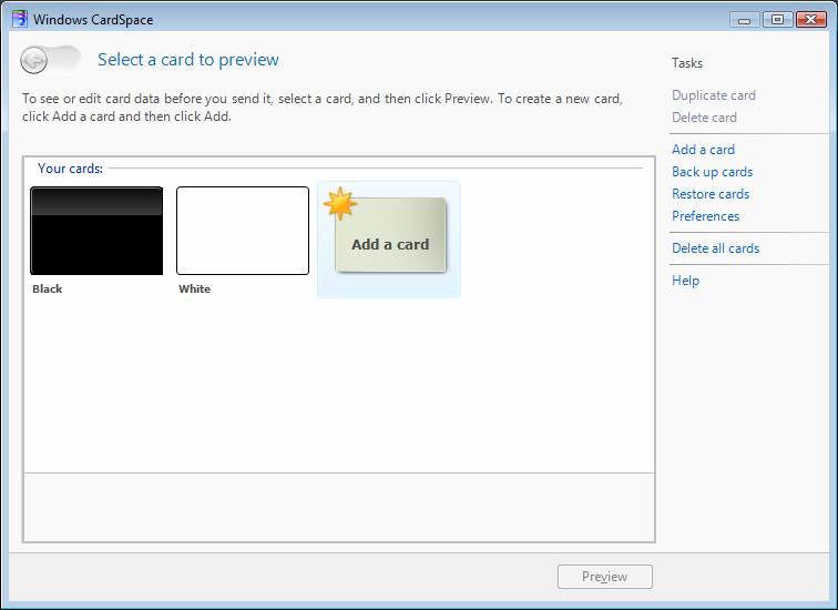
The image below shows the effects described on card backgrounds obtained from uniformly black and uniformly white images.

If you have questions, do not hesitate to post them here. Looking forward to see your CardArt!!! 🙂

2 Comments