Azure AD development lands on portal.azure.com
For the longest time, I watched with envy as my Azure colleagues drove their conference demos from the shiny portal.azure.com, while I had to stick with the good ol’ manage.windowsazure.com.
Well, guess what! Yesterday we announced that the Azure AD management features are finally appearing in preview in portal.azure.com. Jeff wrote an excellent post about it, however, as it is in his nature, he focused on the administrative angle and relegated the development features to a paragraph tantamount to a footnote. That gave me enough motivation to break the blog torpor in which I’ve slid into since finishing the book, and pen for you this totally unofficial guide to the new awesome development features in portal.azure.com. Enjoy!
Basics
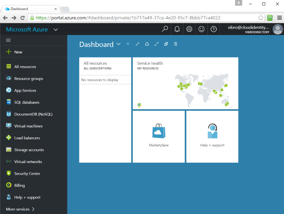
Let’s take a look at this new fabulous portal, shall we. Pop out your favorite browser and navigate to https://portal.azure.com.
You’ll land on a page like the below.
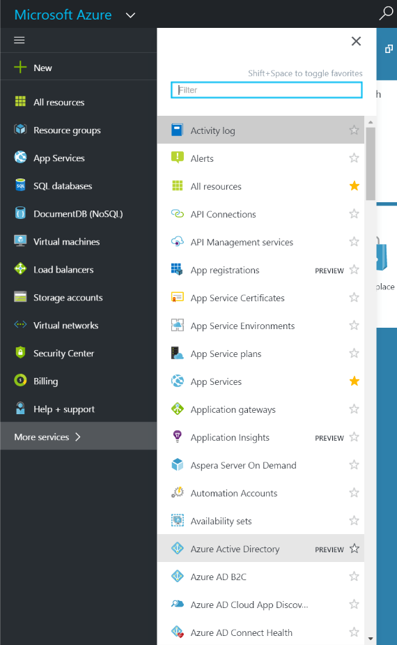
Where is Azure AD? Click on “More services” on the left menu, and you’ll find it:
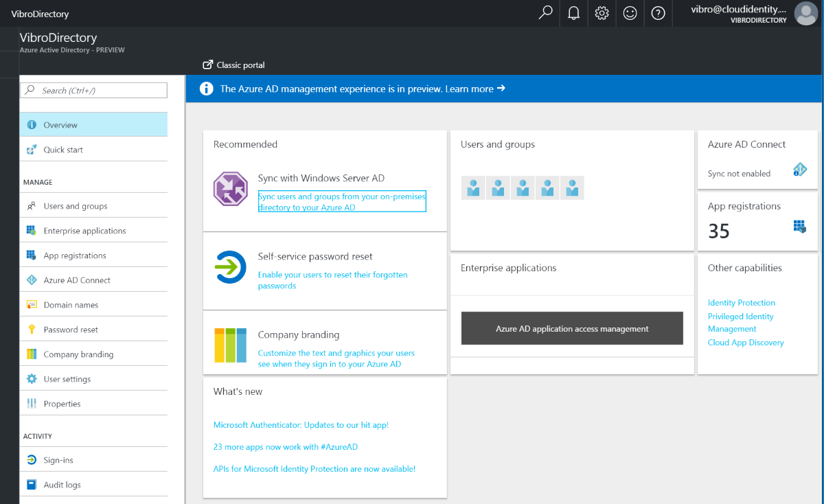
Click on it, and the next blade will open to something to this effect:
As Jeff’s post explains, the landing page offers lots of interesting insights on your Azure AD tenant, and various hooks for management actions.
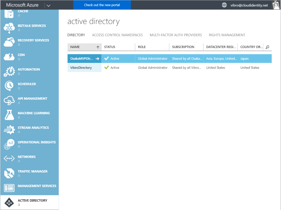
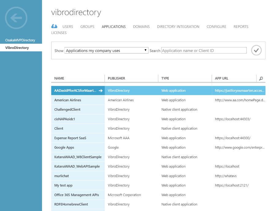
Just for kicks, let’s take a look at the Azure AD landing page in the old portal:
The first thing that jumps to the eye: the old portal shows both VibroDirectory, the Azure AD tenant tied to my Azure subscription, and OsakaMVPDirectory, a test tenant I created when I visited Japan a couple of years ago (I need an excuse to get back there…awesome place, awesome people). That’s because the user I am signed in with, vibro@cloudidentity.net, is a user (more: an admin) in both tenants.
I can easily choose what tenant I want to manage by clicking the corresponding entry.
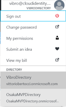
How do I achieve the same effect in portal.azure.com? Simple. See that user badge on the top right corner, informing you about what user and tenant are you currently signed in with? Click on it:
Together with the usual account operations you expect to find there, you’ll also notice that all the tenants accessible by your user will be available for you to choose. Let’s see what happens if I select OsakaMVPDirectory.
Voila’! The portal changed to reflect the new tenant. As you can see, the landing page is far more barren… I’ve used that tenant just for playing a bit with Azure AD, nothing more.
In fact, this is far more barren than you would probably expect from something displayed in an Azure portal… and here there’s the kicker: that’s because this tenant has no Azure subscription associated to it! Don’t believe me? Click on all subscriptions.
That’s right. This is huge, so let me rephrase to make sure you appreciate the implications:
You now have a portal you can use to manage Azure AD tenants that are NOT associated to an Azure subscription.
The office developers among you are probably jumping up and down right now ![]() go ahead, try it! Navigate to portal.azure.com and sign in with your office dev account for your Office tenant, I’l wait. See? that’s awesome!
go ahead, try it! Navigate to portal.azure.com and sign in with your office dev account for your Office tenant, I’l wait. See? that’s awesome!
Now, don’t get me wrong. Having Azure AD capabilities alongside all the other Azure services you are using in your solution is a huge advantage in itself and I am in no way trying to minimize that. I am just excited that the Azure AD development portal capabilities are no longer strictly subordinated to that.
Enough of this – let’s take a look at the meat of the developer features: application creation and editing.
App creation and editing
Let’s go back to the Azure AD landing page on portal.azure.com. Where are the developer features? If you thought “Enterprise applications” – sorry, no bonus. The developer features are all available behind the sibylline moniker “App registrations”. Click on it, and you’ll find yourself on the following blade.
Those are all the apps created in this tenant – that is applications for which the Application entity resides on this very tenant.
Let’s compare with the same view on the old portal.
Some important differences jump to the eye:
- The default view in the old portal lists apps I created in that tenant (“KatanaWAAD_W8ClientSample” – prehistory!!!) and also preintegrated apps (such as Google Apps, American Airlines) and multitenant apps acquired from my other test tenants. The new portal, as mentioned, only lists apps developed in this tenant.
- The new portal lists the application IDs, which are in fact the clientID you would find in your code for identifying the app; that should make it easier to find an entry for an app for which you have nothing but the code.
- The search field in the new portal is live – the list of apps adjusts in real time as you type the search string. I love it.
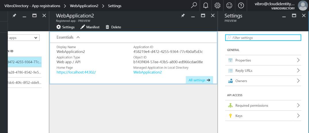
Let’s pick one app and see how it looks like.
The first blade, Essentials, presents a quick summary of the main properties of the app. The settings blade, which opens automatically as soon as you select the app, corrals all the app properties in a neat set of categories. There’s even a nice search field that will show you in which bucket you’ll find the property you need.
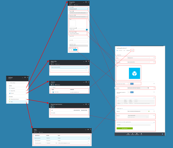
Nearly all the old properties are there: the rather large image below shows the mapping between old and new. I recommend you click on the pic to display the full image.
Most notably, the dev features in the new portal do not offer any of the operations that would affect the ServicePrincipal of your app – that is to say, the instance of the app in your own tenant. In the old portal, creating an app meant both creating an Application object (the blueprint of your app) and provisioning that app right away in your own tenant. In the new portal, creating an app means just creating the blueprint, the Application. The user assignment, app role assignments etc are available in the admin portion of the portal – but you’ll be able to use those against your app only if you do provision it in your own tenant after creation.
If you want to provision your app in your own tenant: you need to run it, attempt signing in with one user from your tenant with the right privileges, and granting consent when prompted. That will lead to the provisioning of the app, that is to say the creation of the ServicePrincipal in your tenant and the assignment of the permissions you consented to (VERY detailed description of the process in this free chapter).
There are lots of neat features tucked in those options, especially in the ones that have been historically difficult to deal with in the old portal. Let’s take a look at my two favorites: permission management and manifest editing.
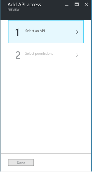
If you go to the Required permissions blade (finally a good name) and click on Add, you’ll find yourself at the beginning of a nice guided experience:
Clicking on Select an API, I get to a clean list of what’s available – even including a search box.
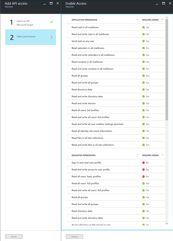
Let’s click on the Microsoft Graph and hit Select.
Now, isn’t that super neat! You get a nice list of permissions, subdivided by application and delegated… and you even get indications on what permissions can only be consented by administrators vs all users! Personally, the colors give me cognitive dissonance: as a developer who isn’t often an admin, the permissions requiring admin consent are the problematic ones. But! The information is there, and that wasn’t the case before.
The other feature I really like, and I am sure it will be your favorite too, is the inline editing of the manifest.
Azure AD applications have lots of settings that can’t be accessed via portal – and sometimes, it’s just better to be able cut & paste settings directly. For that purpose, the old portal offered the ability to download the app manifest (a JSON dump of the Application object, really), edit it locally, and re-upload it to apply changes.
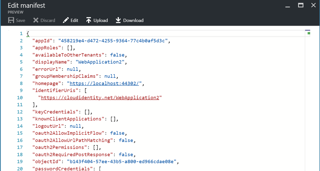
In the new portal, however, you can edit the manifest in place – no need to go through the download-edit-upload cycle! You can access the feature by going back to the Essentials blade and clicking on Edit manifest.
There’s even some rudimentary auto completion support, which is great for people like myself with non-existing memory for keywords.
Try it out!
As diligently reported by the header of each and every blade, this stuff is still in preview. Your input is always super valuable – the right place to provide it in this case is in the ‘Admin Portal’ section of our feedback forum.
I hope you’ll enjoy this feature as much as I plan to enjoy shedding my old portal complex and finally use portal.azure.com at the next conference… which by the way it’s just 10 days away! See you in Atlanta ![]()




Nice intro to AD in the new Azure portal. Will play with the new portal this weekend using this post.
For myself and other co-workers it’s quite hard to start using the new portal as everyone used to use the first Azure AD (https://manage.windowsazure.com/) one. Simply cannot find entities where we expect to find them.
finally!